Brand Kit
Download Brand AssetsLogo
Introduction
First things first, while Kalshi’s communications are comprised of multiple elements, the Logo is the focal point, an instantly recognizable symbol of the brand. That’s why it’s important to use the Logo as specified in these guidelines. Our Logo is a simple and modern wordmark, please follow these guides to ensure it always looks its best.
Clear Space
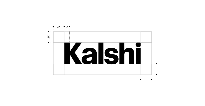
To make sure our logo has impact and always looks its best, we employ clear space to prevent it from becoming cluttered. A minimum clear space has been defined to ensure the integrity and impact of our logo; no text or graphic elements can encroach into this area. The minimum clear space is equal to double the stem of the K, as defined by X in the diagram.
Misuse
It is important that the appearance of the Logo remains consistent. The Logo should not be misinterpreted, modified or added to. No attempt should be made to alter the Logo in any way. Its orientation, color and composition should remain as indicated in this document, no exceptions. To illustrate this point, some of the more likely mistakes are shown here.

DO NOT use old versions of the logo from
the internet.
DO NOT stretch or warp the logo.
DO NOT use logo as masks.
DO NOT crop the logo.
DO NOT apply random colors to the logo.

DO NOT apply textures or effects to the logo.
Logo Sizing
The logo’s width should stay proportional to its layout. As a rule of thumb, keep it to about a quarter of the container width, this leaves enough breathing room for other elements and keeps the wordmark from overpowering the page. Scaling it up to half the container can work for hero moments where the logo is the sole focus, but sizing it any larger, or letting it crowd the surrounding grid and margins, is never acceptable.
Logo width = 1/4 of the layoutAcceptable
Logo width = 1/2 of the layout, usedsparingly for hero momentsMostly Acceptable
Logo width exceeds 1/2 of the layout.Never Acceptable
Logo width = 1/4 of the layoutAcceptable
Logo width = 1/2 of the layout, usedsparingly for hero momentsMostly Acceptable
Logo width exceeds 1/2 of the layout.Never Acceptable
Lockups
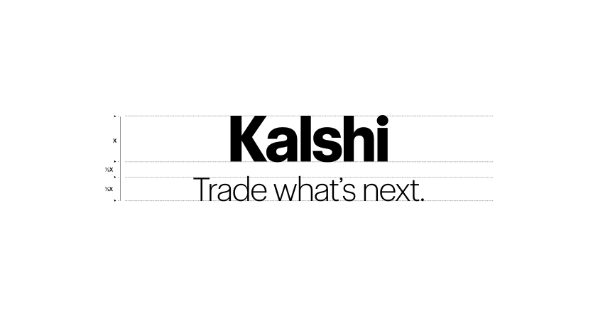
The wordmark can be paired with our tagline, “Trade what’s next.”, in a horizontal or stacked lockup as shown below. Always maintain the minimum clear space — equal to the width of the K — around the full lockup, and never change the relative size or spacing between the two elements.

Sub-Brand Lockups
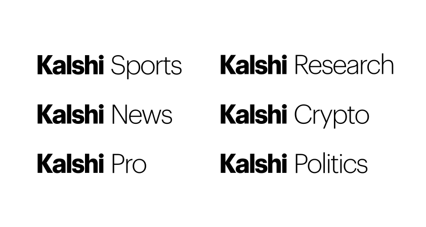
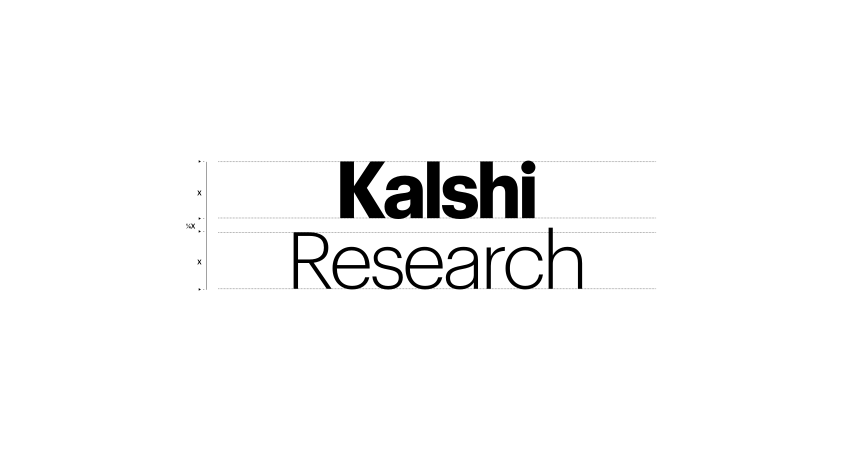
Sub-brand names follow the same lockup principles as the tagline. Pair the bold Kalshi wordmark with the vertical name in the regular weight, either horizontally or stacked, maintaining the same minimum clear space — equal to the width of the K — around the full lockup. Never change the relative size, weight, or spacing between the wordmark and the sub-brand name.
Partnership Lockups
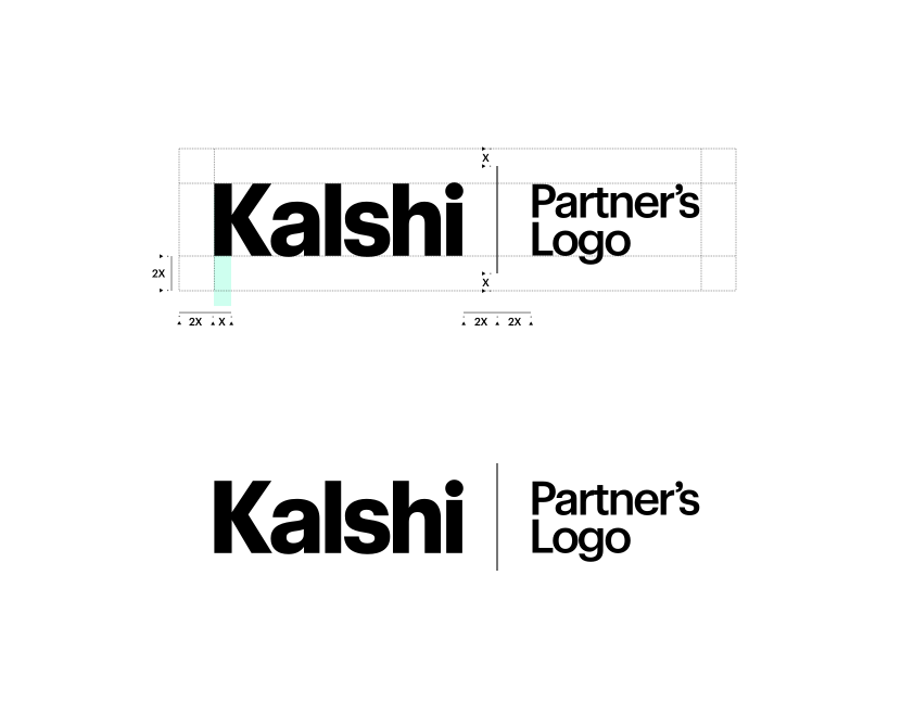
When co-branding with a partner, pair the Kalshi wordmark and the partner's logo at equal visual weight, separated by a single vertical divider. Keep the same clear space and proportions shown below — the Kalshi mark should never be resized or emphasized relative to the partner's.
Logo Color Usage
The Kalshi wordmark must always maintain sufficient contrast against its background. Use the black wordmark on white backgrounds and the white wordmark on black backgrounds. The Lightmode Green wordmark is designed exclusively for white backgrounds, while the Darkmode Green wordmark is designed exclusively for black backgrounds. Using either green wordmark on the opposite background does not meet Kalshi's contrast standards.
Use black logo on white background.
Use white logo on black background.
Use lightmode green on white background.
Use darkmode green on black background.
DO NOT use darkmode green on white background.
DO NOT use lightmode green on black background.
How to Use Our Logo
Do:
Use the logo exactly as provided, without altering its proportions, color, or spacing.
Maintain the minimum clearspace around the logo at all times.
Choose an approved background and logo color combination from the palette above.
Don't:
Stretch, skew, rotate, or otherwise distort the logo.
Recolor the logo outside of the approved combinations shown above.
Place the logo on low-contrast or visually busy backgrounds.
Add effects such as shadows, outlines, or gradients to the logo.
Use the logo more prominently than a partner's logo in co-branded placements.
Typography
Introduction
Kalshi Sans is our primary typeface, drawn in three widths - standard, Condensed, and XCondensed - across five weights from Light to Bold, shown in full below. Use the standard width for most text; reserve Condensed and XCondensed for tight spaces such as data tables, tags, or dense UI labels. Never substitute a system font.
Kalshi Sans is a proprietary typeface and is not publicly available for download. Font files are provided only to approved partners for co-branded or licensed use.
Color
Overview
Kalshi’s brand palette is built from six core colors - White, light gray, two shades of green, Dark Green, and Black - applied consistently across web, product, and print. Each swatch below lists its hex, RGB, CMYK, and Pantone values for accurate reproduction.
White
#FFFFFF
R255 G255 B255
C0 M0 Y0 K0
PMS: N/A (Pure White)
Light Gray
#F5F7F4
R245 G247 B244
C2 M1 Y2 K0
PMS 1 C (Cool Gray)
Darkmode Green
#00DD94
R0 G221 B148
C69 M0 Y64 K0
PMS 3395 C
Lightmode Green
#00B67A
R0 G182 B122
C82 M0 Y72 K0
PMS 3405 C
Dark Green
#014737
R1 G71 B55
C95 M25 Y70 K45
PMS 3435 C
Black
#050D0A
R5 G13 B10
C75 M45 Y65 K85
PMS Black 6 C
Usage
Approved background and foreground color pairings. Crossed-out combinations fall below the required contrast threshold.
White
Light Gray
Darkmode Green
Lightmode Green
Dark Green
Black
Contact
For any urgent brand asks, contact: creative@kalshi.com
Usage Terms
The term “Marks” includes anything we use to identify our goods or services, including our names, logos, icons and design elements. By using Kalshi's Marks, you agree that we own them and that any goodwill generated by your use benefits us.
Permission to use our Marks is limited in the following ways:
- Only use our Marks if they adhere to these brand guidelines.
- The permission we grant is non-exclusive (we can give it to others) and non-transferable (you cannot give it to others).
- We may update this guide, and any changes must be reflected in your usage within a reasonable time.
- We can review your use of our Marks and require changes if needed.
- We may terminate permission to use our Marks at any time, and usage must stop promptly.
Please ensure your integration follows all Kalshi API and platform policies. If your project uses Kalshi's API or data, you may reference Kalshi by name, but do so precisely and accurately, and do not imply endorsement, partnership or affiliation. Do not use “Kalshi” in your app, product or company name in a way that could confuse users about our relationship.